API Marketplace case study
API Marketplace
From ticket queues to self-serve API access for a bank's engineering teams
I designed an internal developer portal that enables engineers to discover API products, compare approval requirements and rate limits, request access to multiple APIs in a single flow, and track each request from approval through credentials and deployment.
The challenge
Getting access to an internal API meant a service ticket, emails to the API owner and an unknown wait. Nobody could see the full catalog, the approval rules, or where a request was.
What I did
Mapped the end-to-end access journey, restructured the portal around developer intent, and designed a marketplace, a cart-based subscription flow, subscription tracking and release onboarding screens.
The result
One place to discover, request and track API access, with approval cost shown before a request is made and credentials issued to applications instead of individuals.
A growing API estate with no front door
The bank's engineering teams publish hundreds of internal API products and proxies, including customer net worth, portfolio risk, account aggregation and identity services. They are the building blocks for advisor tools, mobile apps and back-office services.
The platform existed, but the experience around it did not. APIs were listed in scattered wiki pages, access was requested through a generic ticket form, and the path from "I need this API" to "my app is calling it in production" crossed several tools and teams. The portal's job was to make that path visible, predictable and mostly self-serve while maintaining the controls a regulated bank needs.
Access was slow because it was invisible
When I traced a typical request end to end, the delay rarely came from the approval itself. It came from everything around it: finding the right API, guessing which plan to ask for, chasing the owner, and not knowing what state the request was in.
Hidden catalog
Developers could not browse what existed, so they asked colleagues or rebuilt capabilities that were already published.
Opaque approvals
Which plans needed approval, who approved, and how long it took were unknown until after a ticket was raised.
One ticket per API
A feature that needed three APIs meant three separate requests, each repeating the same justification and app details.
Fragmented release path
After access, onboarding and deployment checks lived in separate tools with inconsistent statuses.
- ✕Ask around or search the wiki for an API
- ✕Raise a generic ticket per API
- ✕Email the owner; no visible SLA
- ✕Keys shared with a person, not an app
- ✓Browse and compare products in a marketplace
- ✓Add several APIs to one request
- ✓See approval rules and typical response up front
- ✓Credentials issued to a registered application
Three roles, one request
Every access request touches three people. Designing only for the requester would have moved the bottleneck, not removed it.
API consumer
Software engineer building an advisor app
Needs to find the right API fast, know the limits and get a working key.
Frustration "I don't know what I'm waiting for."
API owner
Product owner who approves access
Needs complete requests with a clear business reason and target app.
Frustration Chasing missing details over email.
Release engineer
Platform team member shipping components
Needs one view of onboarding, validation and deployment state.
Frustration Status spread across pipelines and tools.
Understanding the API access journey from request to production
To understand the challenges across the API access journey, I conducted one-on-one interviews with engineers, API owners, and the platform team. I also reviewed the existing ticket form and approval process, mapped the complete request-to-production journey, and translated the findings into clear design priorities.
-Interviewed engineers, API owners, and platform team members.
-Audited the existing ticket form and approval process.
-Mapped the end-to-end API access journey.
-Translated findings into clear design priorities.
-Identified recurring pain points and opportunities for improvement.
-Prioritized the findings to guide the product roadmap.
…help engineers get the right API access for their application in one predictable step, while giving API owners everything they need to approve with confidence?
Design the journey, then the screens
I mapped the target journey before drawing UI. Each stage had to answer one question for the user and hand a complete, structured request to the next person.

Principles that guided decisions
Show the cost before the commit
Approval needs, limits and response times are visible at the point of choice.
Bundle, don't repeat
App, justification and dates are entered once for the whole request.
Credentials belong to applications
Access survives team changes and is auditable by app owner.
One status language
Active, pending, rejected and expiring mean the same thing everywhere.
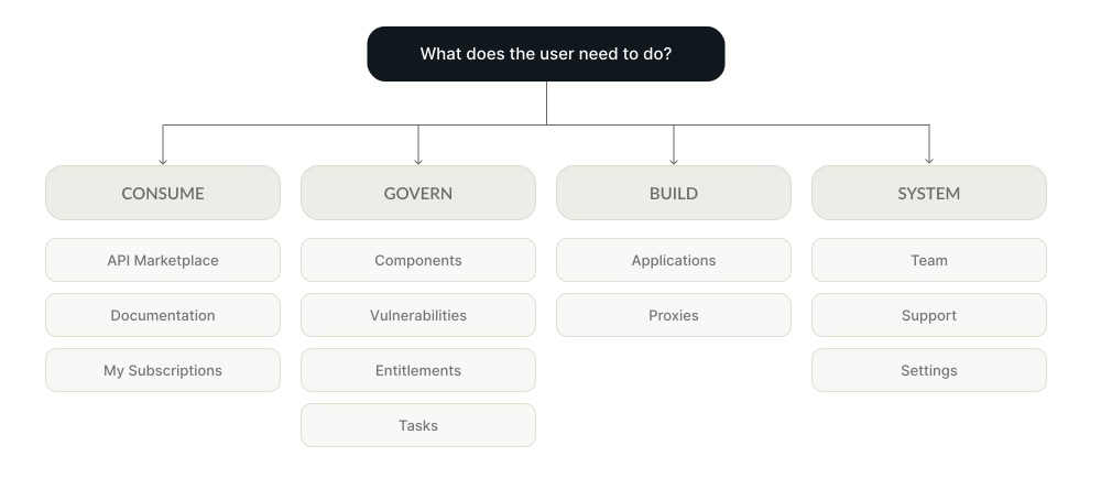
Information architecture
Navigation was grouped by what people come to do rather than by the platform's internal modules.
Key screens and the decisions behind them
Twelve core screens cover the consumer journey from discovery to credentials, plus the onboarding and release views platform teams use after access is granted.
Start with what needs attention
The dashboard answers the first questions of the day: what do I own, is it healthy, and what changed? Applications show API count, last deployment and health together, so a degraded service and its latest release are read in one line (see the screen at the top of this page).
A catalog you can scan in seconds
Each card shows throughput (TPS), the underlying product or proxies, a plain-language description, who else uses it, and your subscription state. Tabs split products from proxies, with search, sort, filters and a list view for denser comparison.
Evaluate without losing your place
Details open in a side drawer over the marketplace, so comparing several products never resets filters or scroll position.
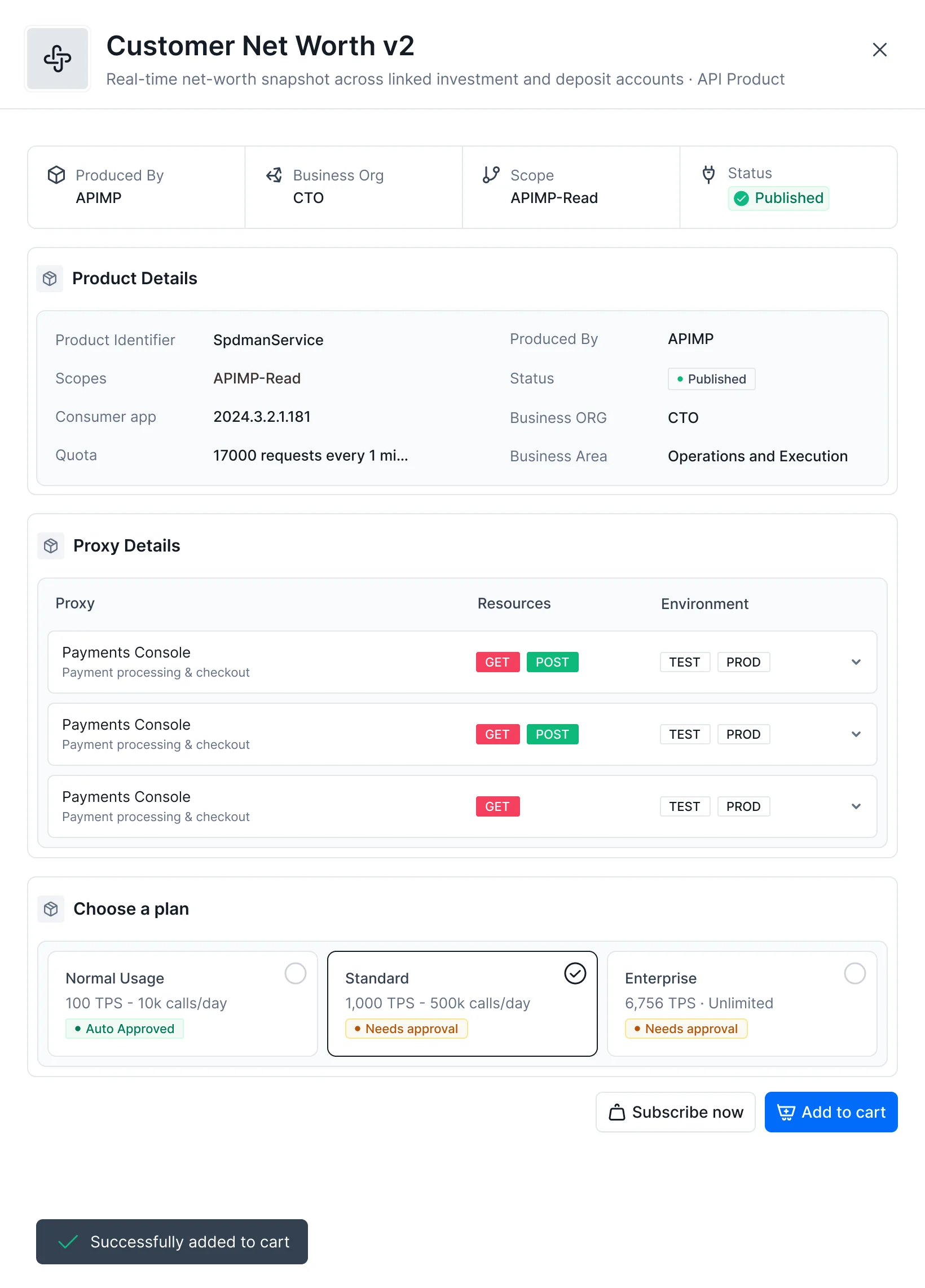
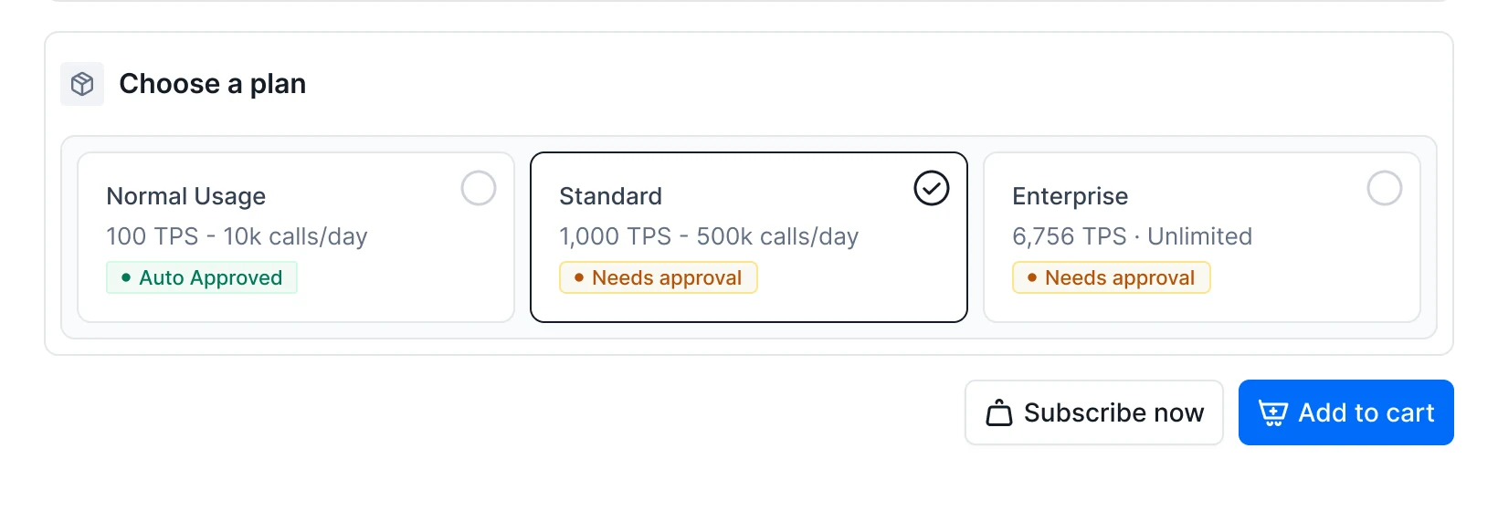
The drawer groups ownership, product details, proxies with their methods and environments, and plans. Each plan states whether it is auto-approved or needs owner approval. This change most directly shortens the path to a key.
Two exits support two intents: Subscribe now for a single API, Add to cart when building up a bundle, confirmed with a toast.
One request for everything a feature needs
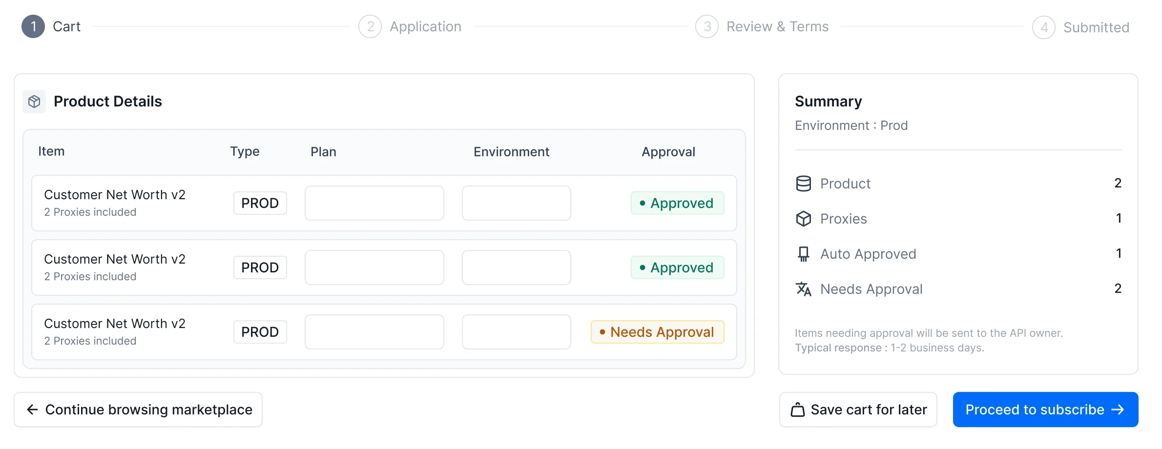
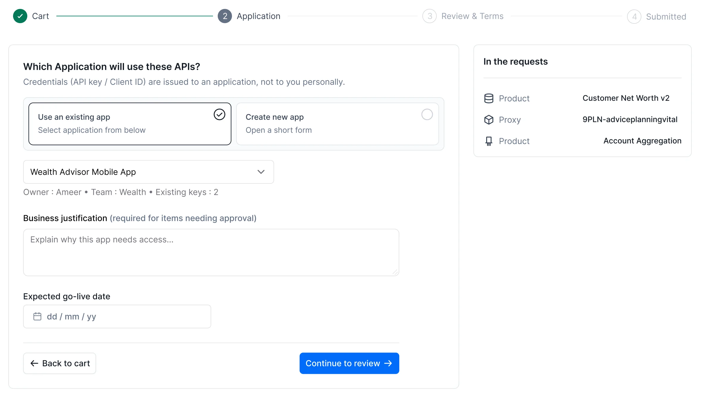
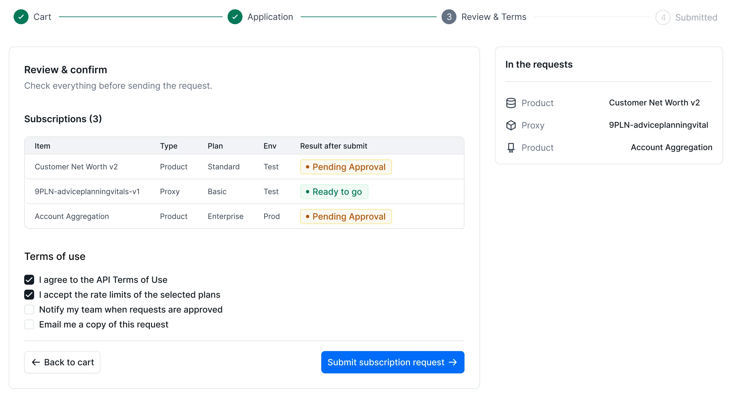
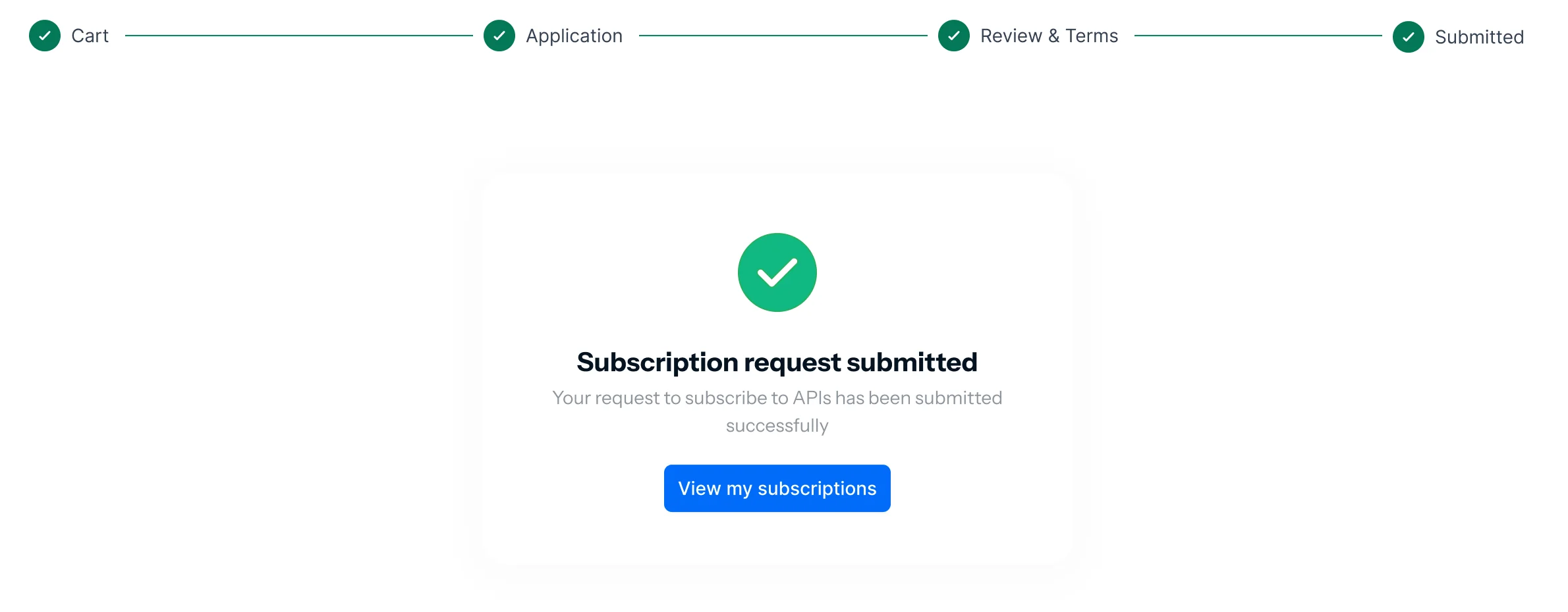
A four-step flow replaces separate tickets. The cart summarises how many items are auto-approved versus waiting on an owner and sets expectations (typical response: 1 to 2 business days) before anything is sent. Credentials are issued to an application, chosen from existing apps or created inline. The review step shows the outcome of each line before submission.
Every request has a visible state and a next action
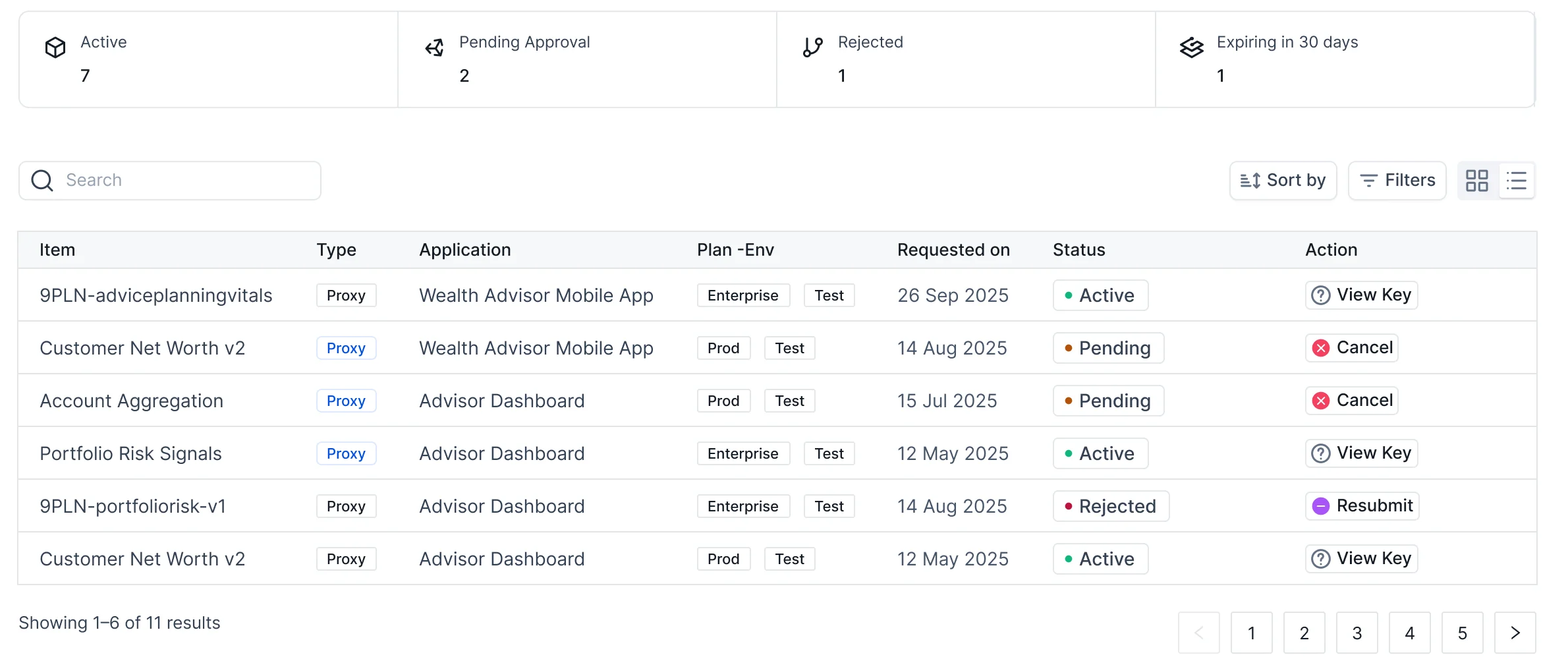
Summary tiles show active, pending, rejected and expiring access at a glance. In the table, the action follows the status: view the key when active, cancel while pending, resubmit when rejected. Nobody has to ask "where is my request?" again.
From access to production in the same place
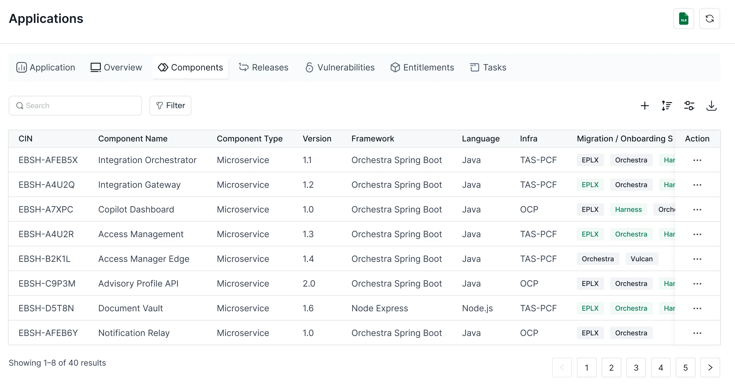
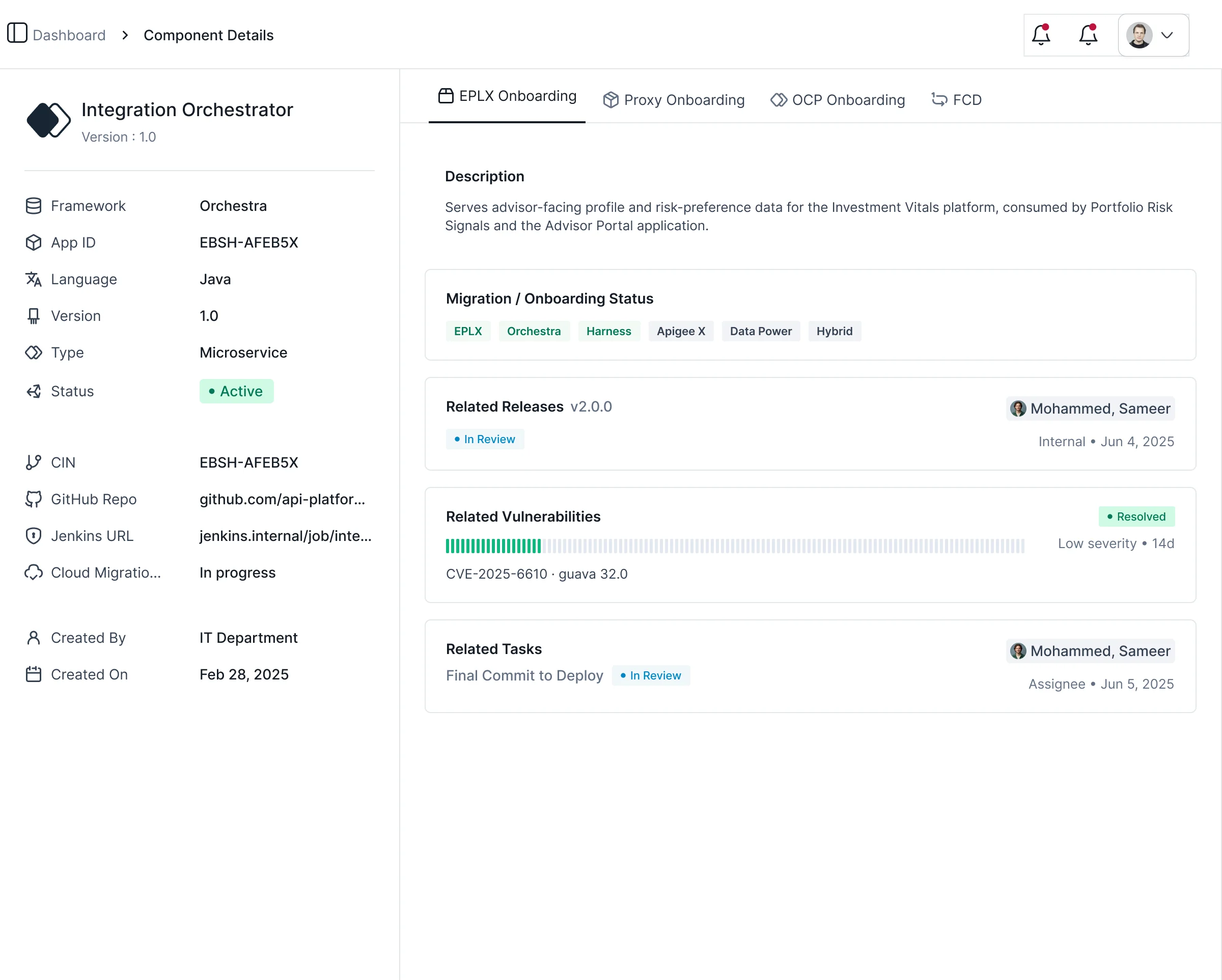
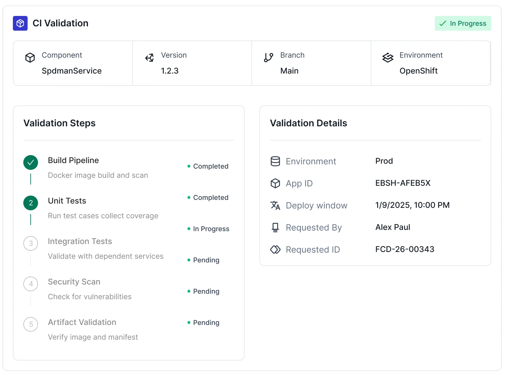
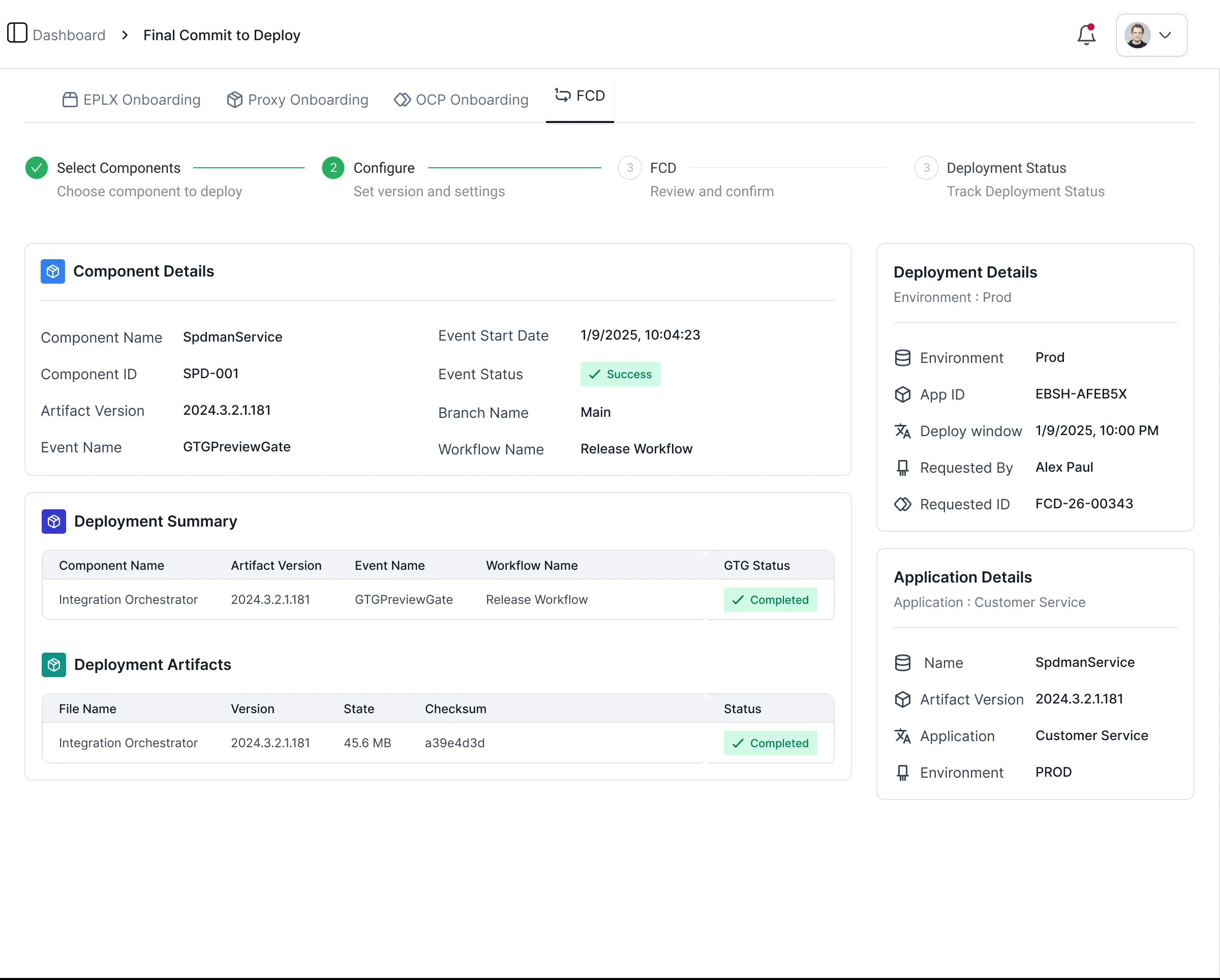
For platform teams, each component has a single record covering its framework, repo, pipeline, migration status, related releases, vulnerabilities and tasks. Onboarding tabs (EPLX, proxy, OCP) and the Final Commit to Deploy flow show validation steps and deployment artifacts with the same status language as the rest of the portal.
Built for density and consistency
I built the screens on a component library in Figma, including buttons, inputs, tabs, steppers, badges, cards, tables, notifications and avatars. This allowed new screens to be assembled without inventing new patterns. The visual language is deliberately quiet so status colour stands out.
One status vocabulary
Every state pairs colour with a dot and a text label, so meaning never depends on colour alone.
Colour with a job
Blue for actions and selection. Green, amber and red reserved for status. Everything else stays neutral.

Structure over decoration
An 8px spacing rhythm, 1px borders for grouping, and shadows only on floating surfaces such as drawers and toasts.
Tables for comparison
When people compare subscriptions, components and deployments, compact tables work better than cards. Cards are kept for browsing.
- AaContrastText, controls and focus states target WCAG 2.2 AA.
- TabKeyboardLogical tab order through steppers and tables; drawers trap and restore focus and close on Escape.
- !StatusLabels, icons and shape carry meaning alongside colour.
What success looks like
These are the design targets the experience was built to move. They should be validated with usage data after rollout.
Same day
Time to first key
For auto-approved plans, down from a multi-day ticket cycle
1 request
Per feature, not per API
Cart bundles products and proxies with shared context
100%
Requests with visible status
From submission to active, rejected or expiring
Fewer rejected requests
Justification and target app are captured up front
Less duplicated build
A browsable catalog shows what already exists
Auditable access
Credentials mapped to applications and owners
Speed came from clarity, not from removing controls
In a bank, approvals will remain because they serve an important purpose. The biggest gains came from making the rules visible early: which plan needs approval, what the owner needs to see, and where a request is right now.
Being the only designer meant owning everything from journey maps to component specs. It also meant building my own quality checks: a final pass over every screen for data consistency, copy and edge states caught issues that would have eroded trust in a tool engineers use every day.
What I'd do next
- Design the API owner's approval queue to close the loop
- Add key management: reveal, copy, rotate and revoke
- Complete empty, loading and error states for every flow
How I'd validate it
- Task-based usability tests: find, request and track an API
- Measure time-to-first-key and rejection rate after launch
- Card sort to confirm the navigation groups with engineers