Email template system case study
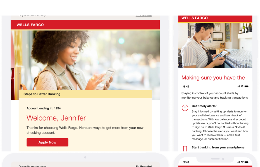

Wells Fargo Email Template System
One modular system for every customer email
Designing a modular, responsive email system that makes every campaign consistent, accessible and faster to build.
Role
UX/UI Designer
Timeline
2024 to 2025
Scope
Research · Design • HTML/CSS
Platform
Email for desktop and mobile clients
Responsibilities
•User research • Wireframing
• Usability testing
• HTML/CSS email development
• Figma component library
Tools
Figma • Adobe Package · HTML • CSS
A shared system for every customer email
Wells Fargo emails customers across onboarding, deposits, lending and cards.
I worked on turning a scattered set of one-off emails into a single, modular template system researching how customers read email, wireframing the structure, testing it with users and coding the final templates in HTML/CSS.
Every email was built from scratch
Campaign emails were designed and coded one at a time. Over the years that produced a patchwork of layouts, type and button styles for every product line, along with a slow, error-prone production process.
Inconsistent
Layouts, colours, type and CTAs varied from team to team, weakening the brand.
Not mobile-first
Many emails were fixed-width and hard to read or tap on a phone.
Slow to produce
Without shared building blocks, every campaign required new design, code and QA.
Accessibility gaps
Small text, low-contrast links and tight tap targets appeared regularly.
One modular, responsive and accessible system that any team can assemble emails from quickly and on-brand.
From research to production code
- Research & auditCollected emails across product lines, mapped recurring content and interviewed stakeholders.
- WireframingDefined a modular page structure and module types before any visual design.
- Component systemBuilt tokens, type styles and 30+ modules with desktop & mobile variants in Figma.
- TemplatesAssembled real campaigns from the modules to stress-test the system.
- Usability testingTested templates with customers on desktop and mobile and iterated.
- HTML/CSS buildCoded responsive, table-based templates and QA’d them across email clients.
Understanding how customers read email
Methods
- Email inventory & content audit across onboarding, deposits, lending and cards
- Stakeholder interviews with marketing, brand and compliance
- Review of customer feedback and engagement patterns
- Heuristic review of existing emails on desktop and mobile
Key insights
Customers scan, they don’t read
→ Strong hierarchy: one headline, short copy, one primary action.
Phones come first
→ Single-column stacking, full-width buttons and 16px side gutters.
Content repeats
→ Around a dozen recurring module types cover almost every campaign.
A modular structure before any pixels
I broke every audited email down into the same stack of interchangeable modules. Wireframes defined the order, hierarchy and how each module collapses from a 600px desktop layout to a single 375px column.
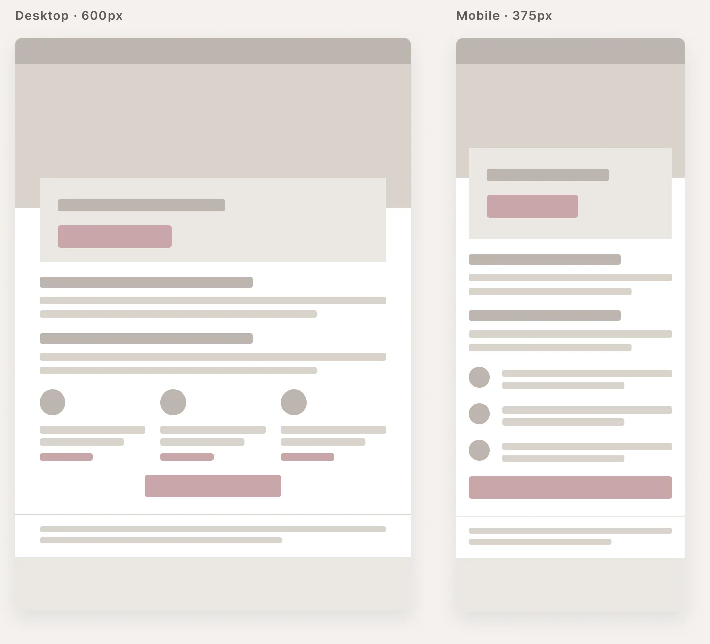
Header & hero
Brand bar, image, headline, primary CTA
Content
Columns, lists, offers, stats, media
Actions
Primary + secondary CTAs, contact options
Legal & footer
Footnotes, links, required disclosures
Tokens, type and spacing
Every module is built on the same variables and text styles, so a single change updates all 30+ components and every template.
- DisplayLight / Regular40 · 34 · 30 · 28 · 26
- HeadingRegular / Bold21 · 20 · 19 · 18
- BodyRegular / Bold / Italic16 · 15 · 14 · 13
- LabelMedium / Bold14 · 13 · 12 · 11
- Small & legalRegular / Medium12 · 11 · 10
30+ modules, one kit of parts
Heroes, column layouts, banners, CTAs, offers, stats, content blocks and footers are all auto-layout components with desktop and mobile variants.
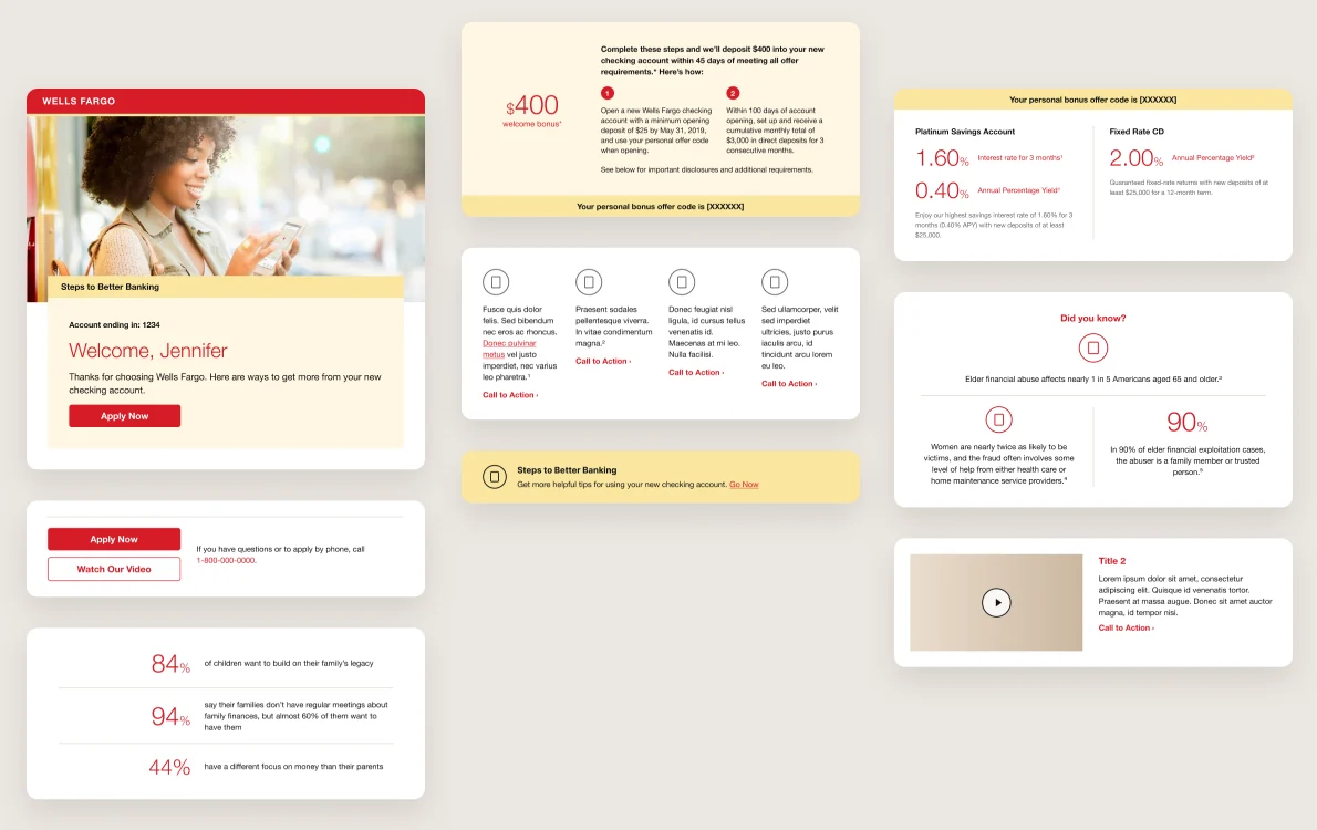
- 5HeroesBrand bar, image, headline and primary action
- 4Column layoutsOne to four columns that stack on phones
- 10Banners & CTAsPrimary and outline buttons, tip banners, offer codes
- 5Content & mediaText blocks, lists, image and video rows
- 6Offers & statsRates, bonuses and large-number callouts
- 8Headers & footersPre-headers, legal footnotes, links and disclosures
Every module ships with a Breakpoint variant
Stacks, never squeezes
Multi-column rows collapse into a single column on phones.
Thumb-friendly actions
Buttons go full-width on mobile with 44px+ tap targets.
Consistent gutters
32 to 40px desktop padding, 16px on mobile.
Swap in one click
Breakpoint = Desktop | Mobile on every component instance.
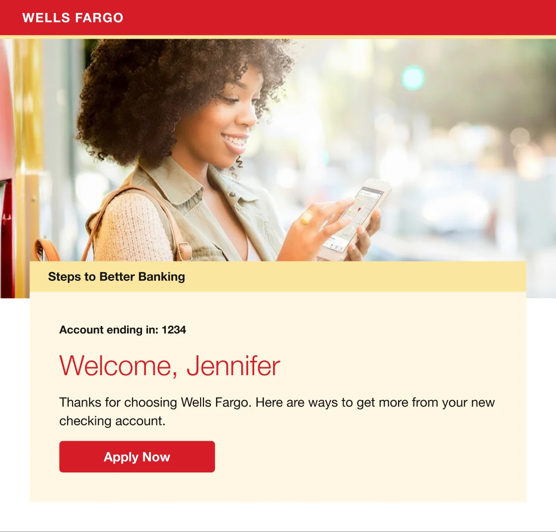
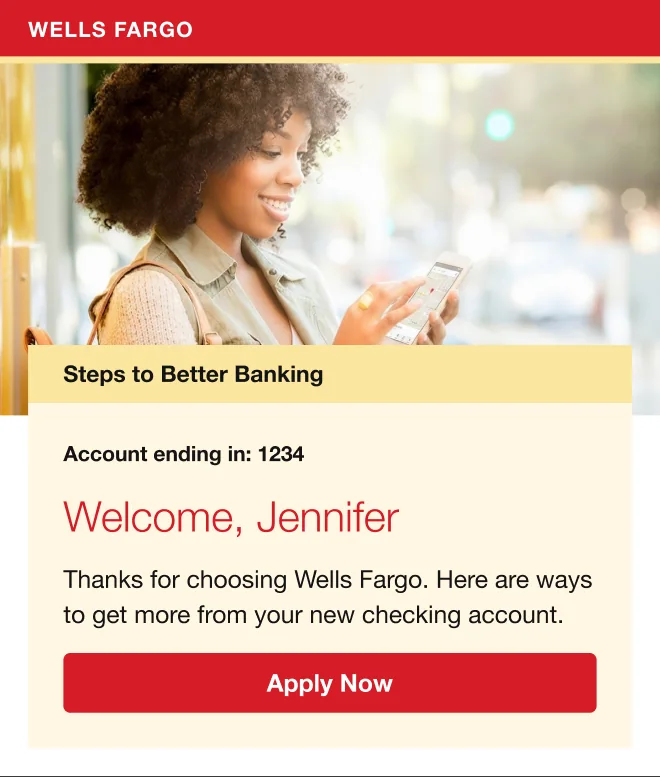
Real campaigns, assembled from modules
Each template is built entirely from library modules. Scroll inside a frame to read the full email.
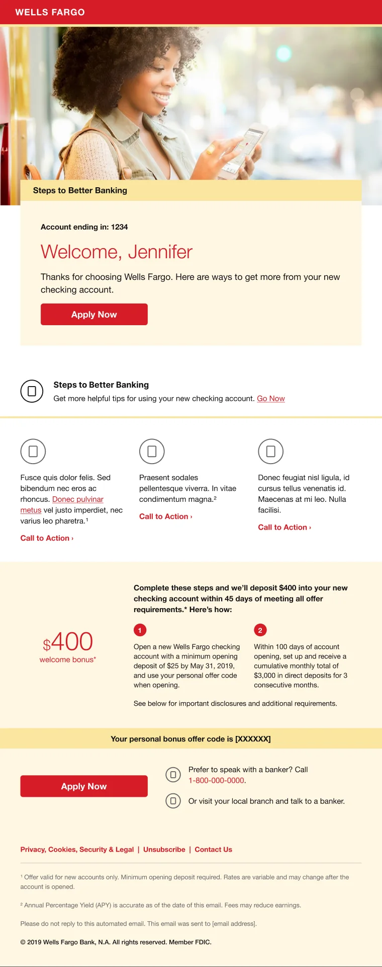
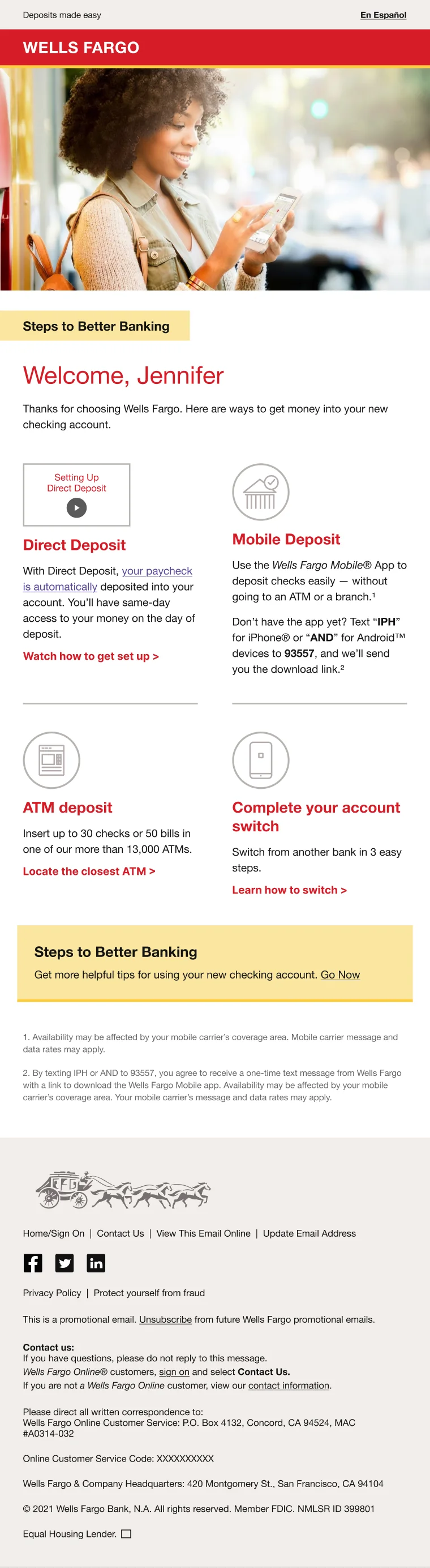
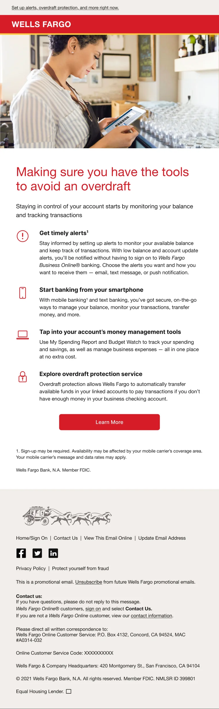
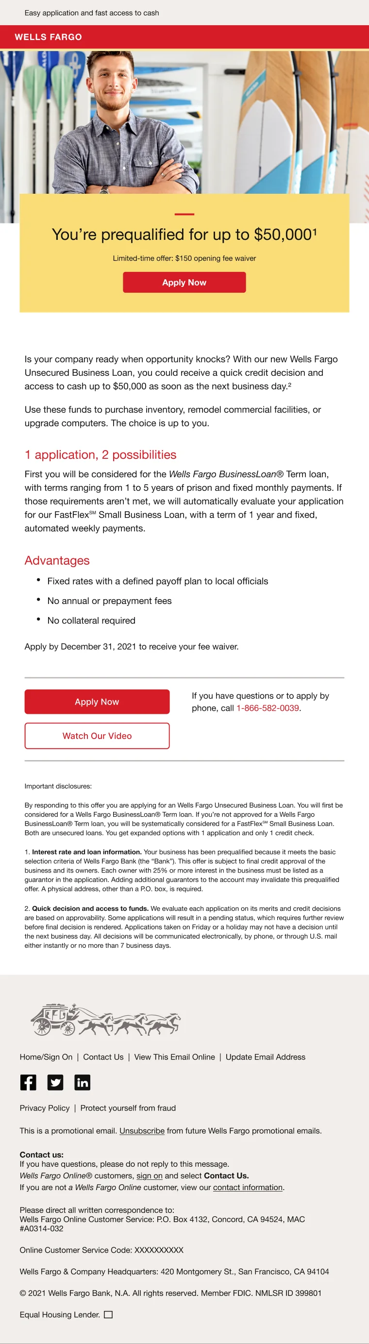
Mobile first: the same templates at 375px
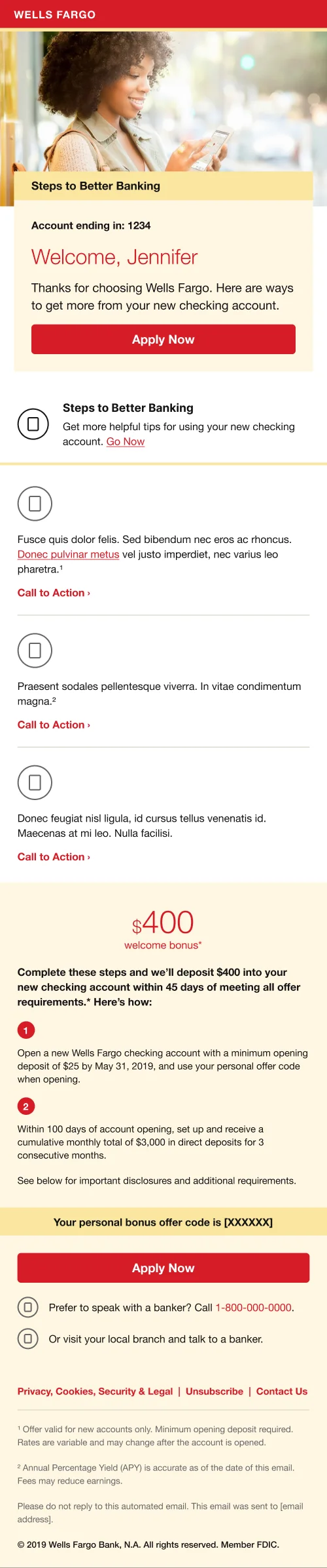



Tested with customers, refined into principles
I ran moderated usability sessions on desktop and mobile prototypes, asking participants to find the main offer, take the primary action and explain the terms. What we learned shaped the system’s rules:
One clear action
A single primary CTA per email; secondary actions use outline buttons so they never compete.
Readable on the go
Body copy at 14 to 16px with 140%+ line height; full-width buttons and single-column stacking on phones.
Terms people can find
Footnotes and disclosures sit below the actions, with bold lead-ins and consistent numbering.
From Figma to production HTML
How it’s built
- Table-based, 600px fluid layouts that hold up in every major email client
- Inline CSS, with media queries to stack columns and widen buttons on small screens
- Bulletproof HTML buttons and web-safe font stacks: Helvetica Neue → Helvetica → Arial
- Alt text, semantic heading order and contrast checks for accessibility
- Cross-client QA on desktop, webmail and mobile before hand-off
Design ↔ code
Every Figma module maps to one table block in code, so the component names designers use are the same ones developers assemble.
<!-- Two-column row that stacks on mobile -->
<table role="presentation" width="100%" cellpadding="0" cellspacing="0">
  <tr>
    <td class="stack" width="50%" valign="top">
      <h2 style="margin:0;font:600 20px/1.25
          'Helvetica Neue',Helvetica,Arial,sans-serif;
          color:#C7081A;">1 application, 2 possibilities</h2>
    </td>
  </tr>
</table>

<!-- Bulletproof button -->
<a href="#" class="btn" style="display:inline-block;
   padding:12px 24px;border-radius:5px;
   background:#C7081A;color:#FFFFFF;
   font:500 14px/1 'Helvetica Neue',Arial,sans-serif;
   text-decoration:none;">Apply Now</a>

@media (max-width:480px){
  .stack{display:block!important;width:100%!important;}
  .btn{display:block!important;text-align:center;}
}What the system changed
Consistent brand experience
Every campaign now shares the same structure, type, colour and CTA styles.
Faster production
New emails are assembled from ready-made modules instead of designed and coded from scratch.
Mobile-first and accessible
Responsive by default, with readable type, clear hierarchy and thumb-friendly actions.
Learnings
- Audit before you design. The content inventory defined the module list.
- Design and code the system together; email-client limits shape the components.
- Test on real phones early; small-screen issues are the ones customers notice.
- Name and document every variant so other teams can build without a designer.